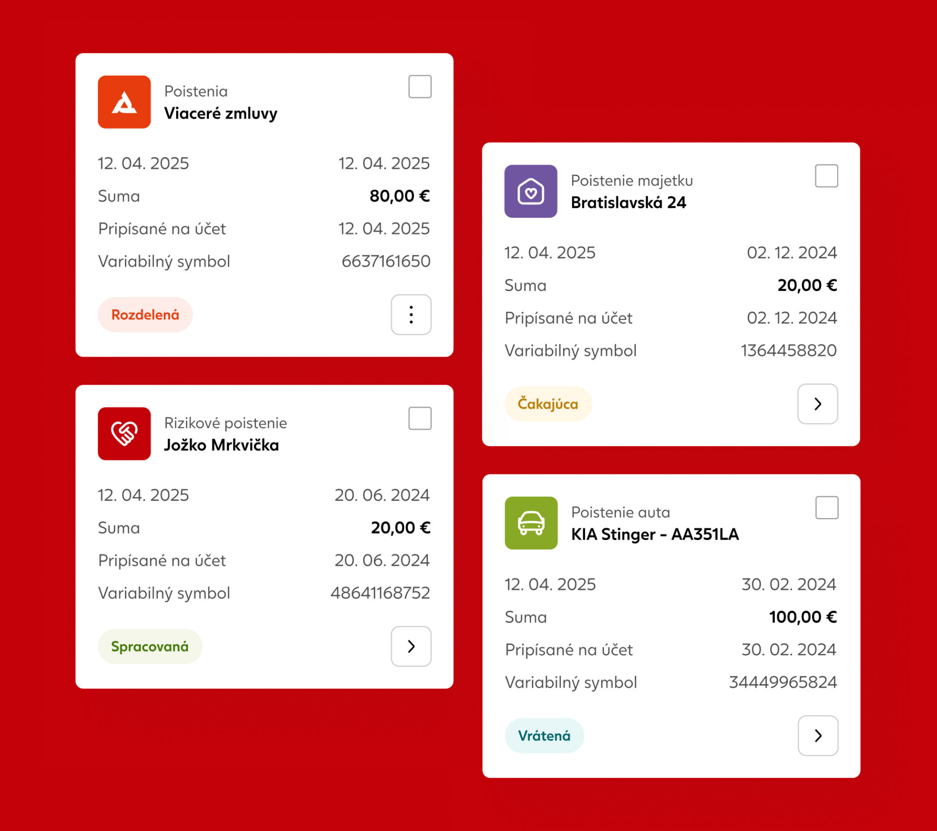
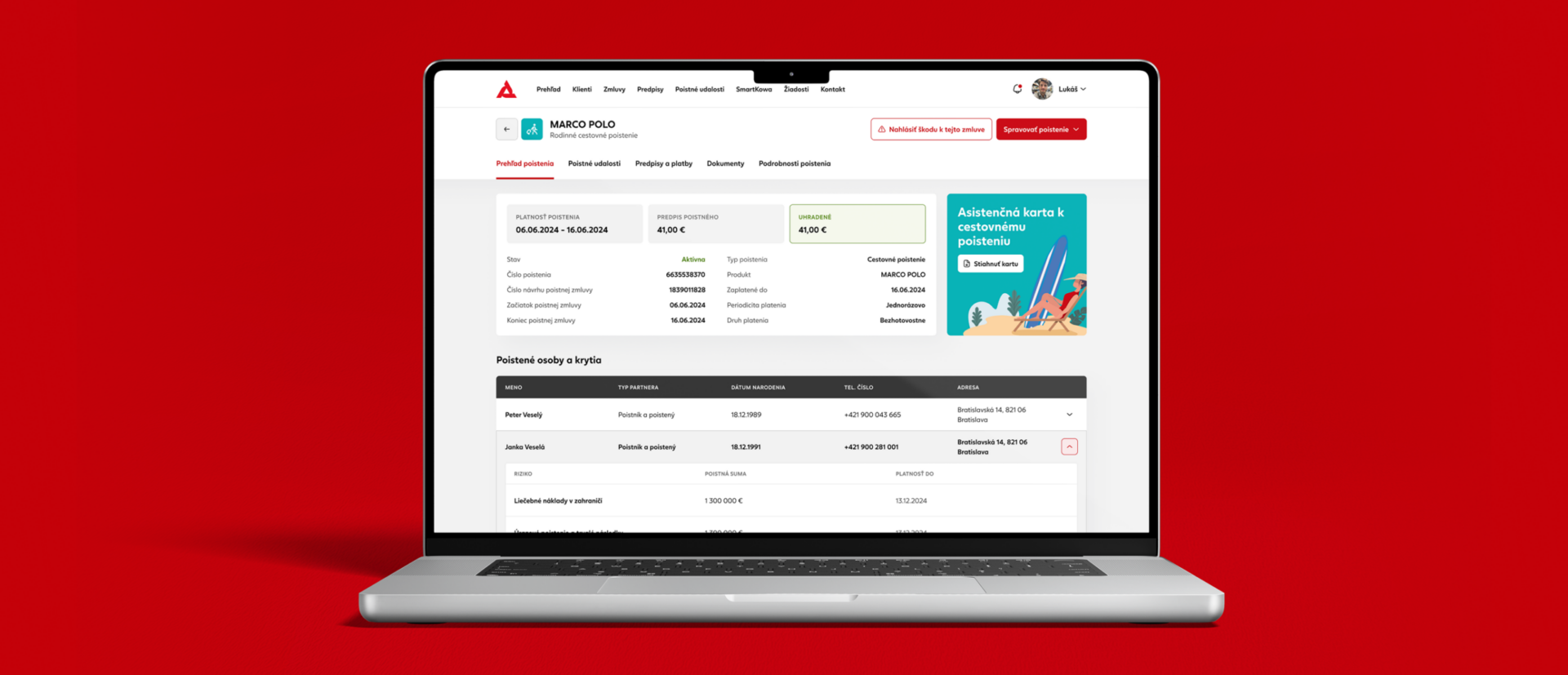
Insurance products are inherently complex. Different contract types follow different structures, contain different levels of information and require users to understand terminology, relationships and actions that are often dictated by underlying business and legal processes. The challenge was not simply to display this information, but to create a system that remains understandable and consistent across life insurance, property, motor and other product types, including complex contracts containing multiple insured persons, objects, risks and coverages.
Complex insurance data → Wireframe → Tested solution → UI component/systemWe approached PKP as an evolving digital product rather than a collection of individual screens. New journeys and requirements are analysed in the context of the entire portal, existing user behaviour and established interaction patterns. We work from information architecture and user flows through wireframes and detailed interface design, continuously looking for ways to reduce cognitive load, establish reusable principles and make even complex insurance scenarios easier to understand.
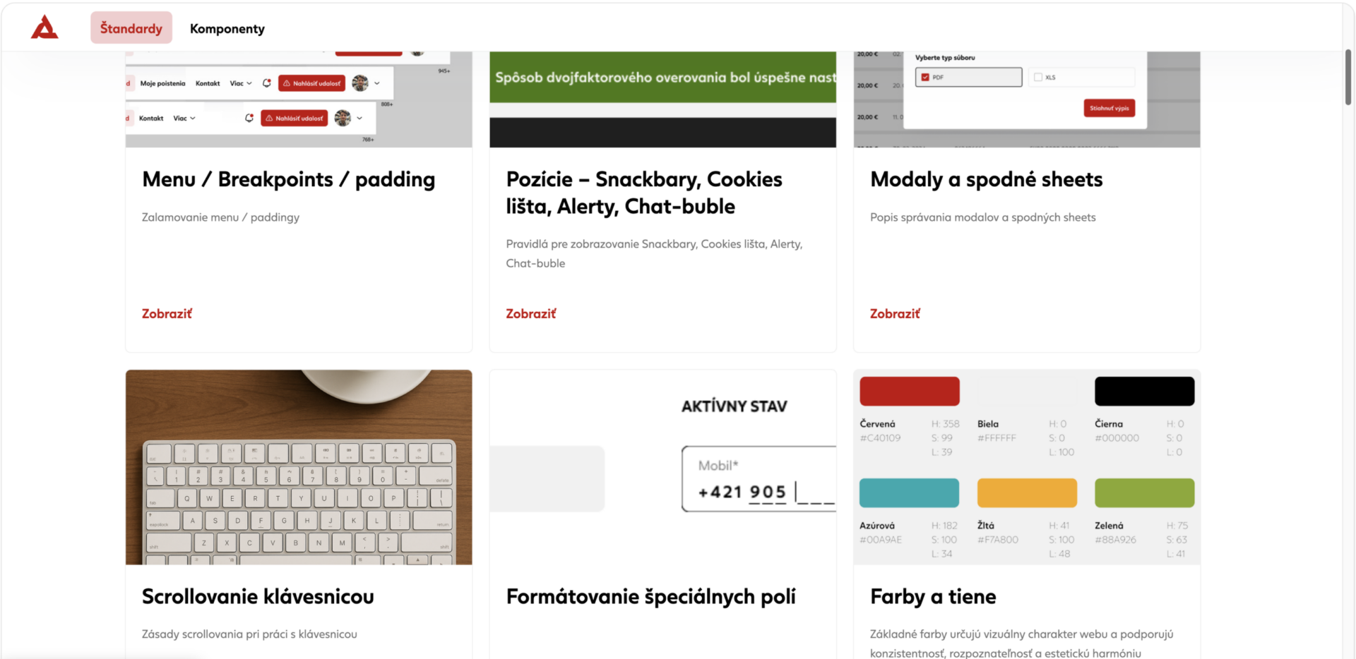
A key part of the work is creating consistency across the entire customer experience. We defined and refined UX principles and interaction patterns that help teams approach recurring situations in the same way — from information hierarchy and navigation to forms, states, actions and communication with customers. These standards create a shared foundation for extending the portal without reinventing the experience with every new feature.
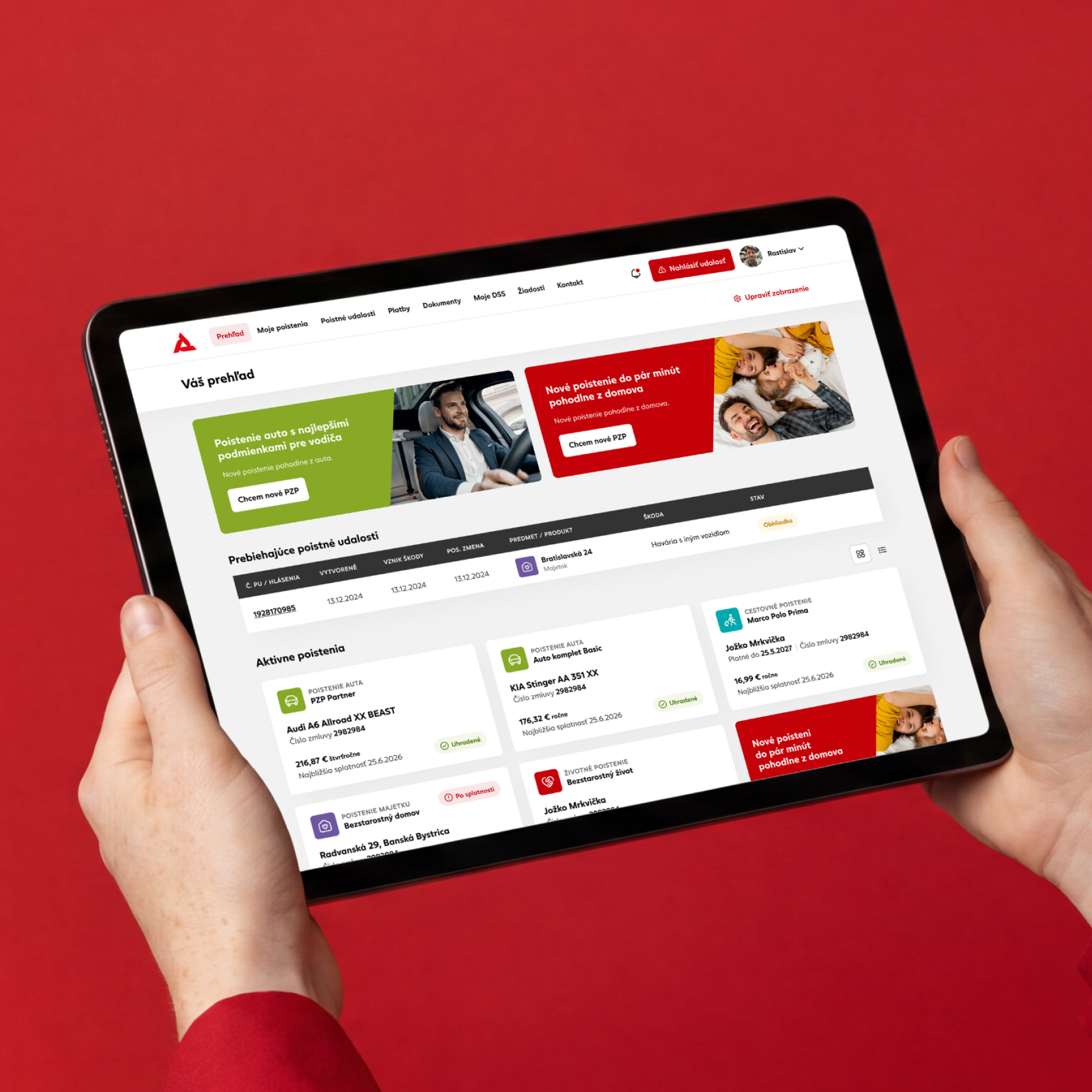
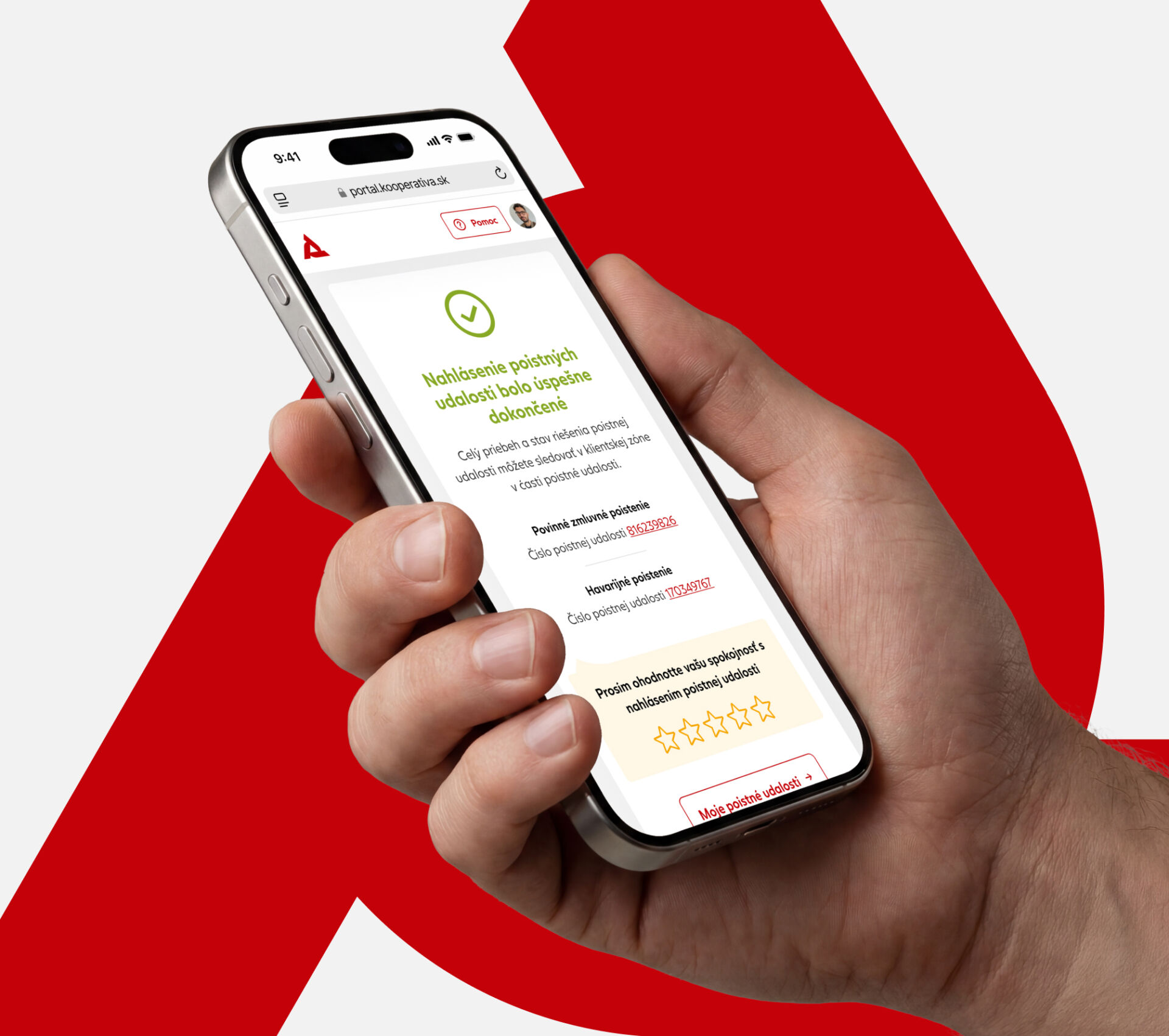
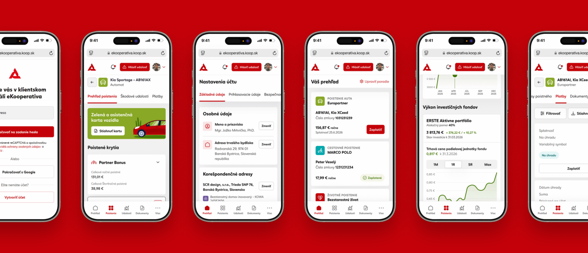
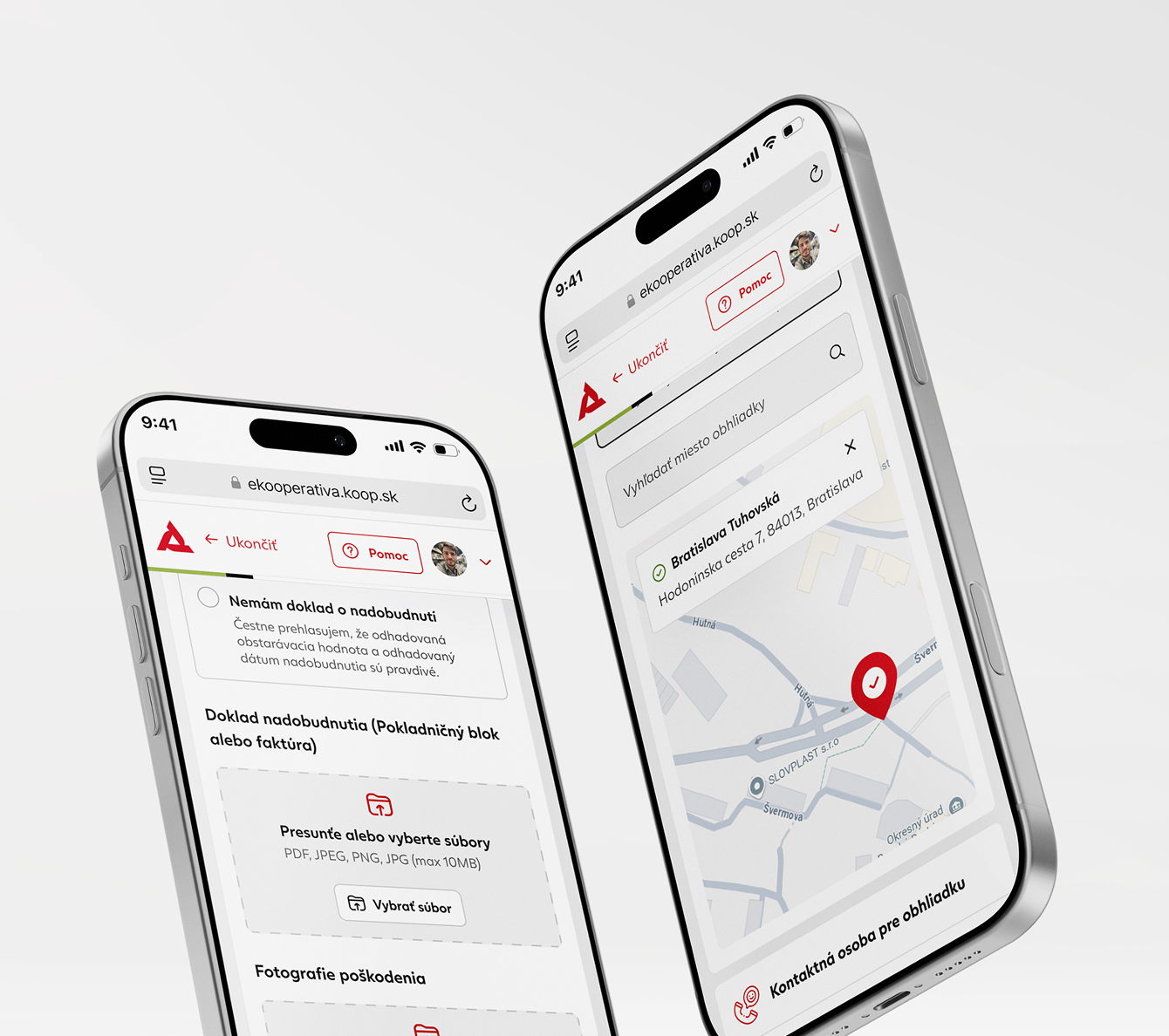
The interface needs to accommodate everything from simple customer settings to highly structured insurance contracts. We designed responsive experiences for desktop and mobile, covering areas such as contract details, complex life and non-life insurance structures, account and consent management and other self-service processes. Particular attention was given to hierarchy, progressive disclosure and contextual information, allowing customers to access detailed insurance data without being overwhelmed by it.
As the portal expanded, maintaining consistency became increasingly important. We developed and continuously extended a shared UI kit and design system with reusable components, states and patterns for different parts of PKP. This creates a common visual and interaction language across products while making future design work more efficient and scalable.
Design decisions are supported by user testing and iterative evaluation. We analyse how customers understand navigation, terminology, information structures and individual interactions, identify points of friction and translate the findings into concrete improvements. Testing is therefore not treated as a final checkpoint, but as part of an ongoing design process that helps the portal evolve around real customer behaviour.
We use cookies to collect and analyze information about website performance and usage, to provide social media features, and to improve and personalize content and ads. Learn more
This site uses cookies
The cookies used on this site are categorized, and below you can read about each category and enable or disable some or all of them. When categories that were previously enabled are disabled, all cookies associated with that category will be deleted from your browser. In addition, you can view a list of cookies associated with each category and detailed information about the cookies. Learn more
Essential cookies Some cookies are necessary to provide basic functionality. Without these cookies, the website will not function properly; they are enabled by default and cannot be disabled.
Analytical cookies Analytical cookies help us improve our website by collecting and reporting on how it is used.
Marketing cookies Marketing cookies are used to track visitors across different websites so that publishers can display relevant and engaging ads.